
This is my 3rd idea for a film poster. This poster’s main difference is that it’s a landscape poster
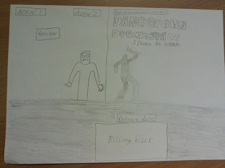
Main image
The main image for this film poster is once again the protagonist. In this poster, he is covering against a wall; this implies that he is in danger or he is hiding from something deadly. His scared emotion on his face, clarifies the genre of the short film to be horror.
Other images
The only other image in the short film is a shadowy form of the killer. This poster stays true to the idea of only displaying small signs of the killer. Behind a wall is supposed to be a light of some sort positioned some the light beam will face the wall further back. This is how I’m supposed to display the shadowy form of the killer.
Background
I was quite unsure on how to adapt the dreamspace universe idea or the white light idea. This poster was originally designed for just the idea of the original house location. If anything, there can be slight tears in the walls and floor, opening an unknown abyss that the protagonist has dreamt up. I’ll have to ask the target audience about what they think. An important thing to take into account is the corner of the wall; it’s meant to be positioned at the centre of the wall. This is to represent some sort of borderline between good and evil, as both left and right of the poster differ in terms of lighting which contain different connotations.
Main title
It is positioned differently than the other poster. In this version of the poster, it is positioned on the right, in the dark area of the film poster. The right side of the poster has the most space which would give the title enough room, while the darkness would make the white text stand out.
Other titles
The majority of titles in this film poster juxtapose from the previous posters in terms of positioning. The actor’s names are now placed on the left while director’s previous films are now brought up to the top. As the main title was moving up I wanted to give a bit of space for the title to lie in. The director’s previous films have also moved up because since the previous posters have included that specific title to be above the main title, I thought I might as well apply the same rules to this poster. The poster’s tagline has been moved to the right and beneath the main title. The positioning to the right was because I wanted the wall corner to be displayed perfectly without anything above it so it would stand out more. Positioning downwards was mainly because of the spacing issues. However, the release date and billing block stay the same. These titles conventionally should remain at the bottom of the poster and it would give the darkness at the bottom of the page something to not remain empty.
Development if needed
To me, the positioning of the upper titles was a bit of a mess. If this poster is chosen, I will try to rearrange the titles in a better way so it doesn’t look like a complete mess; especially on the right side of the poster. Just like the previous blogs, I will also add the extra detail such as screenings and production company logos.
