Film poster development 3

Standard

I had the opportunity to use a really high quality camera. I would have used this to re-take my main image and background.

IMG_0538

This is the new re-taken shot. Despite the high quality, it also feels more saturated than the previous shot. It wasn’t too hard re-erase some of the background for thelocation tears. In the layer boxes in Photoshop, there is an icon of an eye on the left side of the box.

Picture 4

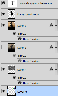
The eyes indicate that the layer is visible, you can see that the old image currently doesn’t have an eye beside it, meaning that it’s not visible.

If you press the eye, it is supposed to hide certain layers, making them invisible until you re-click on the eye. All I did was hide the re-taken shot and remembered the areas wear the tearing was positioned. After you’ve found an accurate location, you can start erasing.

Picture 6Picture 7

After this was done I had to put in some reviews. The review would be an example of how the ancillary tasks link together.

Picture 8

I’ve also made another update on the 3 top titles. Instead, the titles will just be the same font but in a smaller font.

I now think that I’ve finished my film poster. I’ll post the poster with the rest of the coursework on a “Completed project” post soon.

Film poster development 2

Standard
Picture 30

This is an update on the poster’s development

In this blog post, I continued with my development of my film poster. The first thing to do was to remove some of the main image’s background to display the tearing of the dreamspace.

Picture 29

There are 2 layers underneath the main background. The first layer is a background of TV static noise. The layer underneath that is a TV’s testcard. The use of TV related background layers that both TV and dreams can relate to each other as they both present creative imagery.

film poster shadow

The 2nd thing I had to do was to add the killer’s shadow. For this, I firstly started with taking a photo of myself holding the axe while wearing a hoodie. I masked out the image on Sony Vegas, made it black and then took a photo of that image with a white background. I then removed the white background so the image is transparent. I then save the picture so I can implement it without the use of removing the background later.

Picture 32

As I inserted the shadow onto photoshop, I then had to blur out the image to make the shadow look more realistic. This was found in the filters on the top bar of photoshop.

Picture 31

The last thing I did was to finish off the titles on the top of the poster. These included:

  • Actor names
  • Tagline

Firstly, I said in the previous post that I wasn’t happy with the spacing of the titles. What I did do though, was move the tagline a bit lower because there was still a lot of black space created by the gradient tool. The next thing I wanted was a change in font. I thought that the top titles having the same font looked a bit dull. However, I thought already that the range of fonts on the poster was large enough, so that only left me the choice of using one of the pre-used fonts available. For this, I’ve decided to use the same font as the “From the director who brought you…” line. The font used was more thinner which wouldn’t stick out too much.

It’s quite possible that I may need to re-take the background and main image due to the camera quality. If I do re-take, I’ll need to use a better camera that I have at my disposal to capture a better quality image. This also means however that I’ll have to re-edit the image again, putting in the fades on the top and bottom and tearing up the location again.