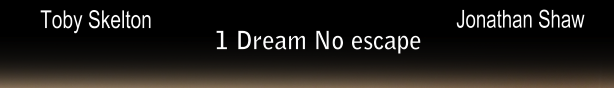
The short film
The film poster
The film review

The short film
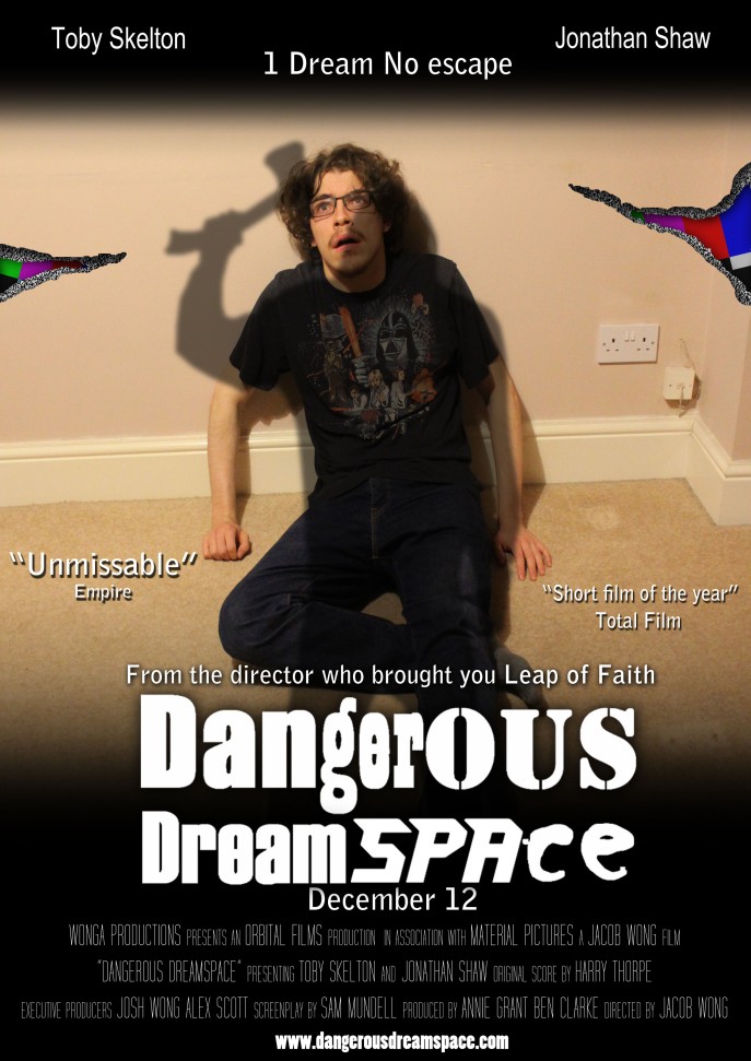
The film poster
The film review

After my short film was available, some people from my target audience gave their response from it.
1st response
Name: Josh
Age: 21
Transcript response: “It was absolutely incredible. I love the several plot twists which stirs up my understanding and keeps me thinking throughout the whole film. The use of the same scenario is the same idea as I was fully aware of the scenario that was going to happen when the protagonist wakes up. The film was actually scary in some areas which was also supported by the use of minimal light as well. Finally, the music and sound effects provided really suited the fast-paced situation really well. Overall, it’s a fantastic short film, worthy of watching again.”
2nd response
Name: Matt
Age: 20
Transcript response: “really, really good. The tension throughout the film was excellent. Also, the use of lighting and shading was just right for the film. One example that used the shadows well was when the killer slowly approached Toby with saucepan. I watched it twice because I didn’t want to miss anything. Toby’s performance was great, worthy of an Oscar!!!
This is my final editing post for my final edit.
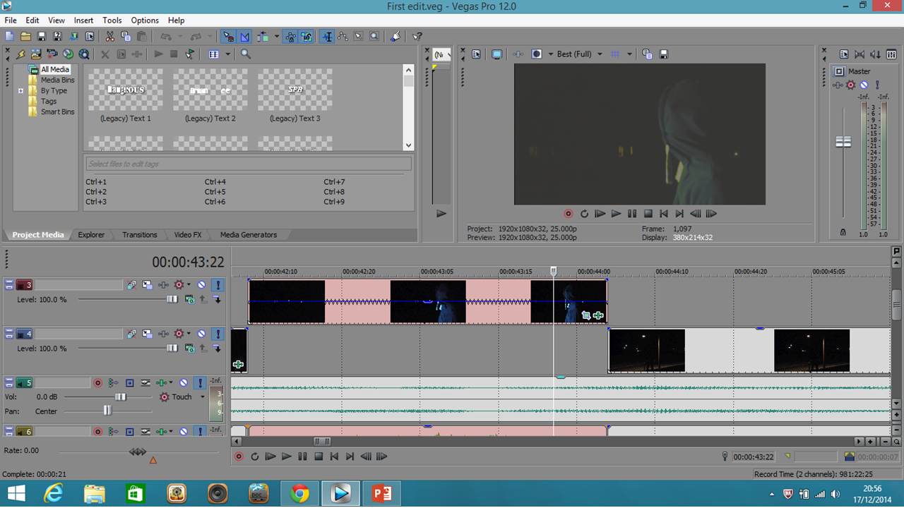
Most of the editing here was just simply placing new footage in any gaps of where old footage used to be. Again, you can see that I’ve had to speed up some footage as it was too long to begin with. If you haven’t seen the previous editing posts, the sign that I’ve sped up or slowed down some footage is the zig zag line.

As I said in the previous post, I talked about adjusting the colours using colour correction for some shots so the new light replicates the original yellow light in the shot. There was however, a way to change the colour of the light through adjustment settings on the light itself. Although this is easier, it somehow came out green at long distances.

There was now to add the the new voice of the killer. This was also the time where I had to add the reverb (echo) to create the killer’s signature laugh. The reverberation mode at the top chooses the type of echo will be made in terms of room name. For example, the reverberation here is a “rich hall”. The 3 meters beneath adjust the compression in and out and length of the echo. The laugh occurs twice. Each laugh has different echo ranges between them. One laugh occurs when the killer picks up the saucepan while the other is when he starts strangling Toby in the 2nd ending. The laugh in the 2nd ending has the longer echo as it will help imply the killer’s sadistic interests. This would mean with the the more intensified laugh when strangling Toby, it would convey that the killer is more into hand based killings rather than relying on objects.
With this done, I’ve now completed my final edit. I’ll show this in “The completed project” post when everything is done.
Continuing on with my film review.
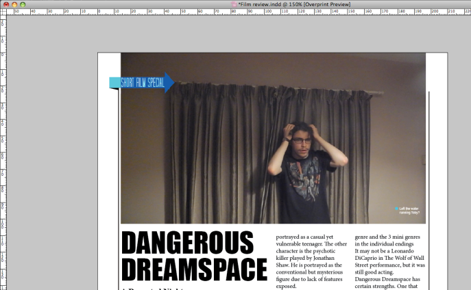
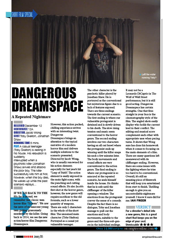
The main image for my film review will be the shot of where Toby has just shut the curtains and turns around to think. Toby putting his hands on his head in a panicking emotion conveys that he is losing the control inside his head because the dream is becoming a nightmare. The caption provided will be “Left the water running Toby?” I’m choosing this mainly because of Toby’s panicked emotion.
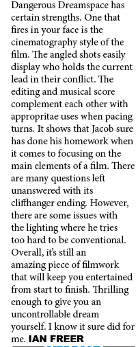
I finished off the review with the last few paragraphs being:
Positives and negatives are always a pain. Just like anyone else in my media class, they wouldn’t like to point out negatives of their own work. Firstly, for positives, I’m went and talked about the 4 main elements of a film (Mise-en-scene, cinematography, sound and editing). Obviously my negatives would have to be towards the lighting.
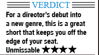
I finally made a verdict and gave my short film 4 stars out of 5. I’m also giving a comment saying that it was a great start for a director’s debut into a new genre. This is also where I’m going to add a quote that I can relate back to in the film poster.
After the review was done, I started focusing on the extra details of the design.

For example, 1 extra detail discovered is the light blue box left of the blue arrow at the top left of the main image. This has a triangle underneath with a black vertical line that comes down the page on the right side of the triangle.
This line comes down to the bottom of the page and crosses a large black rectangle.

On the right end of this rectangle, there is a sentence saying “Over 14000 reviews” in a light blue font and “on empireonline.com” in a white font. This sentence has an additional light blue right arrow.
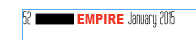
In the bottom left of the page, there is the page number, an unknown black rectangle, “EMPIRE” in a red font and the issue date.
The empireonline link is also in the bottom right corner of the page.
![]()
There is an additional horizontal line under the black rectangle that crosses the whole page.

Finally, there is a vertical line that is the same length as the vertical line on the left side of the page put on this time, it’s on the right side of the page.
I’ve now finished my film review. I’ll post my review in “The completed project” post soon.
I had the opportunity to use a really high quality camera. I would have used this to re-take my main image and background.
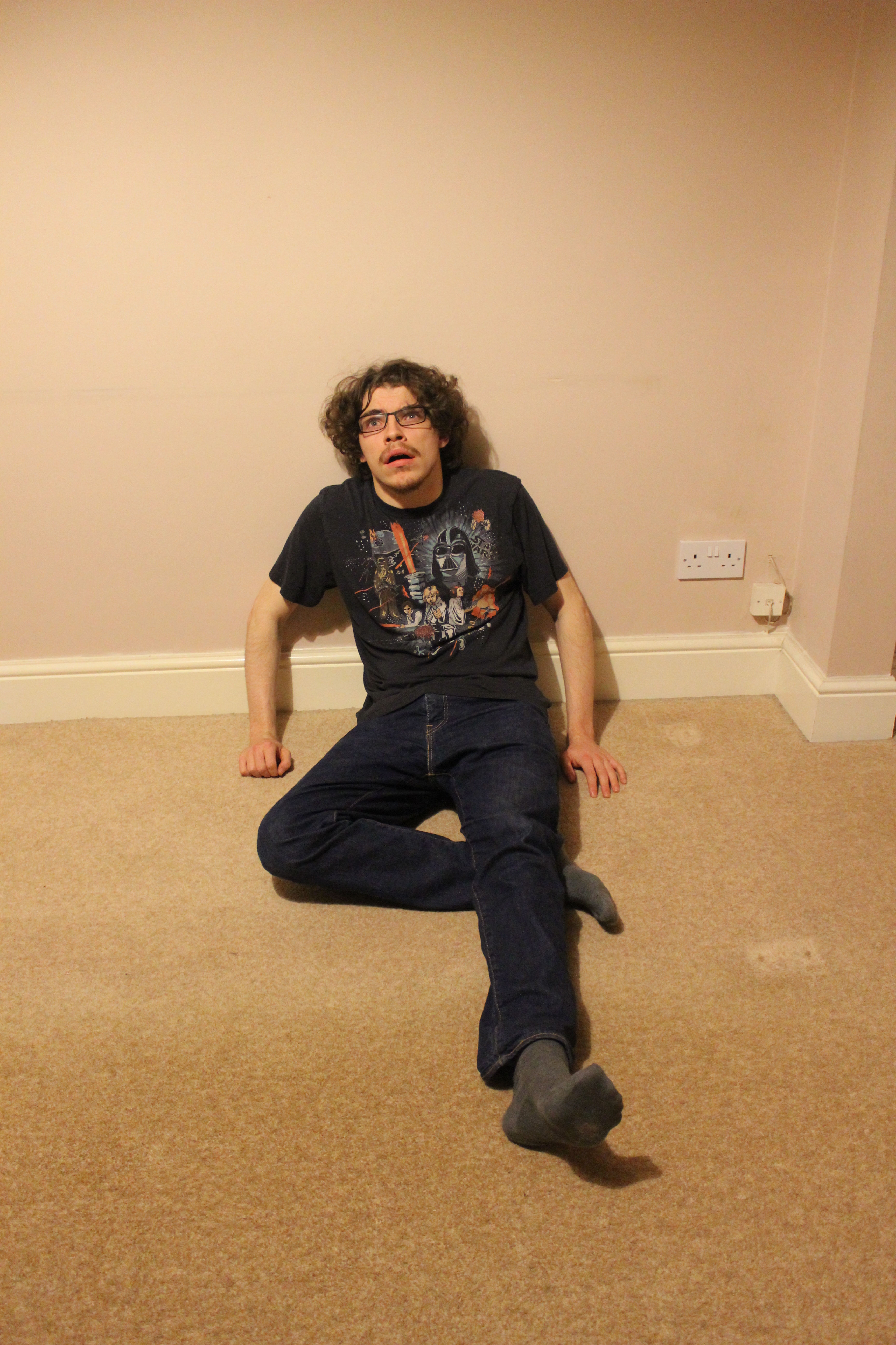
This is the new re-taken shot. Despite the high quality, it also feels more saturated than the previous shot. It wasn’t too hard re-erase some of the background for thelocation tears. In the layer boxes in Photoshop, there is an icon of an eye on the left side of the box.
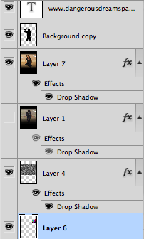
The eyes indicate that the layer is visible, you can see that the old image currently doesn’t have an eye beside it, meaning that it’s not visible.
If you press the eye, it is supposed to hide certain layers, making them invisible until you re-click on the eye. All I did was hide the re-taken shot and remembered the areas wear the tearing was positioned. After you’ve found an accurate location, you can start erasing.
After this was done I had to put in some reviews. The review would be an example of how the ancillary tasks link together.
I’ve also made another update on the 3 top titles. Instead, the titles will just be the same font but in a smaller font.
I now think that I’ve finished my film poster. I’ll post the poster with the rest of the coursework on a “Completed project” post soon.
I was now able to start editing my final edit.

I’ve done a little extra while I was away. I recorded some new dialogue from the killer. This time, it will not be low pitched and it will and it be more a realistic sounding voice. However, John wasn’t really comfortable with recording the killer’s signature laugh, so instead, I went and recorded this myself. This new laugh is based on the Happy Mask Salesman’s laugh of the N64 game Majora’s Mask (Yes, I’m aware of how nerdy I sound), adding the additional reverb (echo) as well. This is the laugh:
The new lighting was easily adjustable to the real lighting in the shot. Colour correction is set into 3 adjustments: low, medium and high. Low must be left alone as it changes the colour of the entire shot. Medium changes colours of most of the main images and foregrounds inside the shot. High changes the colour of any detail and edges.
I’ve also made my own punching sound effects as well. Like many professional mainstream films, I created my sound effects with specific objects. I made these sounds with a pillow, 2 coasters and a hot water bottle with its specific furry coating. The hot water bottle simulate the material of skin, the 2 coasters replicate the bones and the pillow makes sure my fist didn’t touch the floor.
