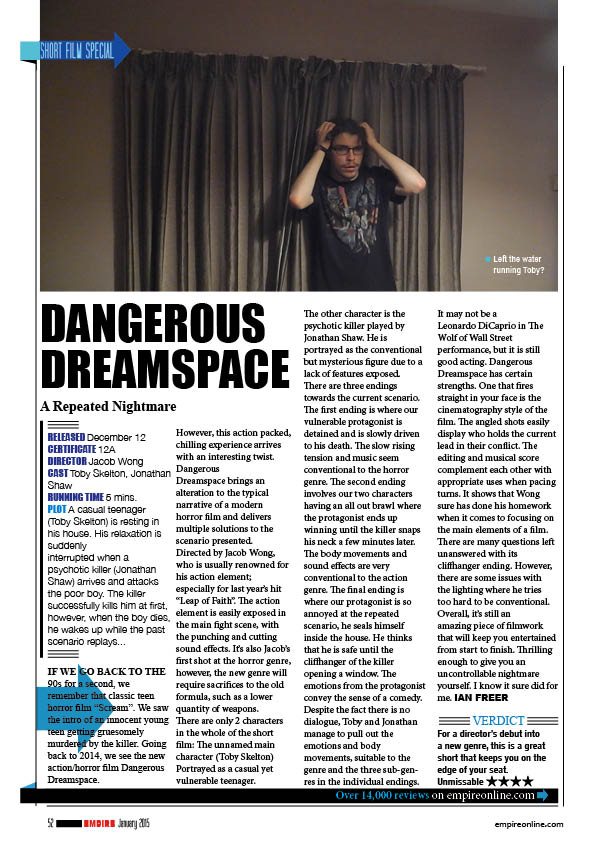
The short film
The film poster

The film review

The short film
The film poster
The film review
I had the opportunity to use a really high quality camera. I would have used this to re-take my main image and background.

This is the new re-taken shot. Despite the high quality, it also feels more saturated than the previous shot. It wasn’t too hard re-erase some of the background for thelocation tears. In the layer boxes in Photoshop, there is an icon of an eye on the left side of the box.
The eyes indicate that the layer is visible, you can see that the old image currently doesn’t have an eye beside it, meaning that it’s not visible.
If you press the eye, it is supposed to hide certain layers, making them invisible until you re-click on the eye. All I did was hide the re-taken shot and remembered the areas wear the tearing was positioned. After you’ve found an accurate location, you can start erasing.


After this was done I had to put in some reviews. The review would be an example of how the ancillary tasks link together.
I’ve also made another update on the 3 top titles. Instead, the titles will just be the same font but in a smaller font.
I now think that I’ve finished my film poster. I’ll post the poster with the rest of the coursework on a “Completed project” post soon.

This is an update on the poster’s development
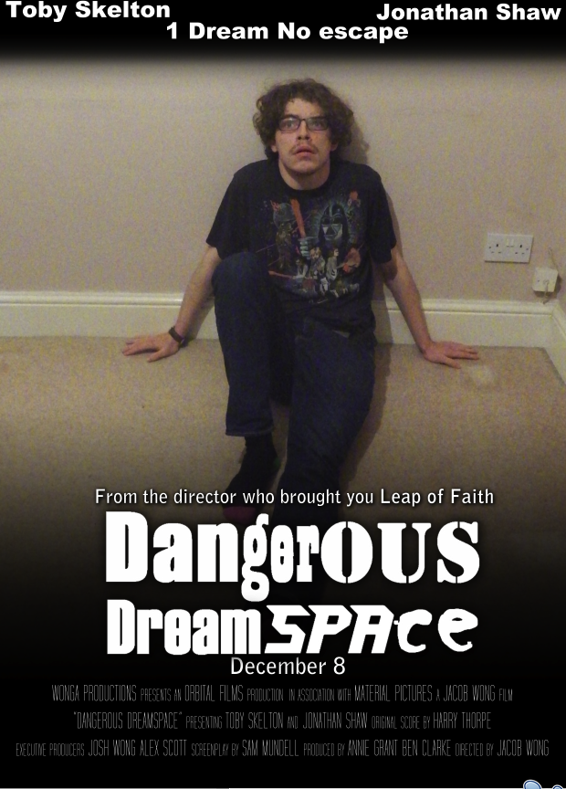
In this blog post, I continued with my development of my film poster. The first thing to do was to remove some of the main image’s background to display the tearing of the dreamspace.

There are 2 layers underneath the main background. The first layer is a background of TV static noise. The layer underneath that is a TV’s testcard. The use of TV related background layers that both TV and dreams can relate to each other as they both present creative imagery.

The 2nd thing I had to do was to add the killer’s shadow. For this, I firstly started with taking a photo of myself holding the axe while wearing a hoodie. I masked out the image on Sony Vegas, made it black and then took a photo of that image with a white background. I then removed the white background so the image is transparent. I then save the picture so I can implement it without the use of removing the background later.

As I inserted the shadow onto photoshop, I then had to blur out the image to make the shadow look more realistic. This was found in the filters on the top bar of photoshop.

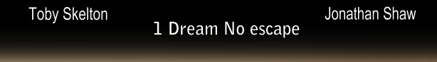
The last thing I did was to finish off the titles on the top of the poster. These included:
Firstly, I said in the previous post that I wasn’t happy with the spacing of the titles. What I did do though, was move the tagline a bit lower because there was still a lot of black space created by the gradient tool. The next thing I wanted was a change in font. I thought that the top titles having the same font looked a bit dull. However, I thought already that the range of fonts on the poster was large enough, so that only left me the choice of using one of the pre-used fonts available. For this, I’ve decided to use the same font as the “From the director who brought you…” line. The font used was more thinner which wouldn’t stick out too much.
It’s quite possible that I may need to re-take the background and main image due to the camera quality. If I do re-take, I’ll need to use a better camera that I have at my disposal to capture a better quality image. This also means however that I’ll have to re-edit the image again, putting in the fades on the top and bottom and tearing up the location again.
I have now started development on my film poster. I’ve looked at a variety of photoshop techniques to help me develop it. I firstly started off with the gradient tool on the main image.
This is the poster so far.
I wasn’t too pleased with the outcome because the tool barely darkened where I wanted it to. I went over the outcome with another use of the gradient tool and it was adequate enough. Despite this I will have to use a shadowy effect on the main title because some of the title will still be in the bright areas.

The outcome of the shadowy effect was outstanding. The shadow blended in with the darkness really well. Before this, I had to use the magic eraser tool to remove the background. The tool worked perfectly, removing all of the black background around the title and inside the holes of letters like Ds and Ps. 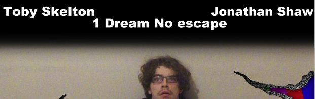
One crucial feature I added was the actor titles and tagline at the top of the poster. I was a bit disappointed about how it was spaced out. I may bring the tagline more down and have a change in font as it looks too repetitive as the top title fonts look too repetitive.
Another crucial feature I added onto the poster was the billing block. I looked around at other billing blocks to identify the order of people and job types and the size of the fonts. The font I used for the billing block was called “Tall films” which can be downloaded from www.dafont.com. I’ve discovered that the whole of the billing block is in capitals and the size of the font shrinks when displaying the job type or what this part of the film was made by. Amazingly, the billing block spacing was perfect, meaning the billing block doesn’t go too wide or to big in length.
In the next development post of my film poster, I’ll be adding the location tear and adding the killer’s shadow
I’m now starting development for my film poster. The software I’m using for this is Adobe Photoshop CS5; which I have little experience with. In my lessons, I’ve been looking at the tools available and seeing what I can do with them. The first tool I can use is the magic eraser tool; similar to chroma key on Sony Vegas.

The checkered area is what the magic eraser has removed. This could be used to remove the background on certain images. The alternate to magic eraser would be masking.

If you can see, there is a dotted outline around the can light. What’s inside the outline will determine what will be kept and put into main poster image. This could be used to erase what the magic eraser couldn’t.

An example of where I would use this is a removal of the title background. In my opinion, this technique is a lot quicker than download all of the fonts I need onto the macs. The image above is actually a bit old, the title will not be on one continuous line but will be one word above the other for spacing issues.

Another tool I will use is the regular eraser. This eraser basically removes anything from an image. What I can do with this is remove some of the main image’s background, creating precise shapes. As I said in previous film poster posts about tearing up the location, this tool will be good for just removing the floor or wall. With this used I can add some unknown space-like image; which will be layered behind the main image. The unknown space represents openings outside the dreamspace, implying that the dream is uncontrollable.

Another tool I’ve found is the gradient tool. This tool creates a fading look around images.

For my film poster, I’ll be using this on both the bottom and possibly the top of the poster. The gradient tool will just fade to a black to convey the evil presence nearby.

I’ve also edited some titles as well. The effect I used here was a shadow effect. I may use this on the main title just in case the gradient tool didn’t really darken the background and main image where I wanted to position the title. The shadow may blend in with the darkness quite well.
